Cisco Systems, Inc.
UI and Visual Designer / Remote / 2021 - 2024

Company overview
Cisco Systems, Inc. is a global technology leader that provides cutting-edge products and services to businesses worldwide. The top Fortune 500 company specializes in networking, cybersecurity, collaboration, and computing tools.
My role
As a UI/Visual Designer on Cisco’s Digital Studio team, I helped build the global design system for Cisco.com, leading foundational explorations and supporting its shift to a scalable framework. I also designed UI components and patterns for Cisco.com.
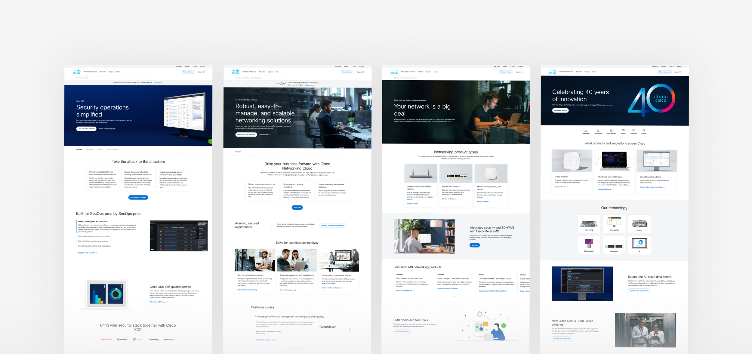
Cisco.com is one of the company’s most valuable digital assets, attracting over 100 million visitors annually across 59 country sites in 27 languages.
I joined the UI team in 2020 to help redefine the website’s interface and establish a cohesive global design system. My contributions spanned refining scalable system foundations, leading design explorations, and creating/delivering high-impact deliverables like the UI Kit, style guide, and system documentation.
While these proprietary internal documents and files can't be shared, I transitioned to the Pattern and Components pods post-rollout—design work from this phase can be viewed on this webpage. To view the system’s core foundations applied in context, click the button below.

Breadcrumb pattern UI/UX design
I enhanced this site-wide navigation pattern by enabling additional links on larger screens. Overseeing the UI and UX—I defined truncation rules, addressed content edge cases, ensured compatibility with internationalization standards, and more. View breadcrumb project.
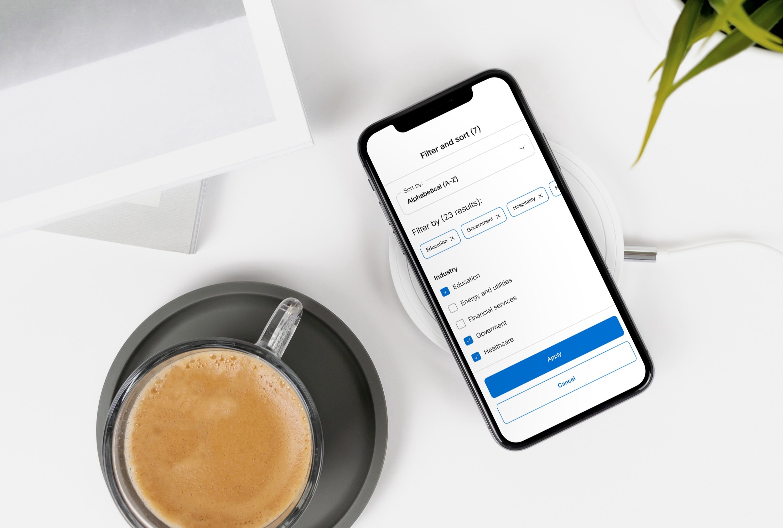
Filter pattern UI design
I designed two clean, responsive filter pattern variations that seamlessly adapt across all screen sizes. Over several months, I collaborated with UX designers, a project manager, content owners, developers, and key stakeholders to bring the design to life. View filter project.
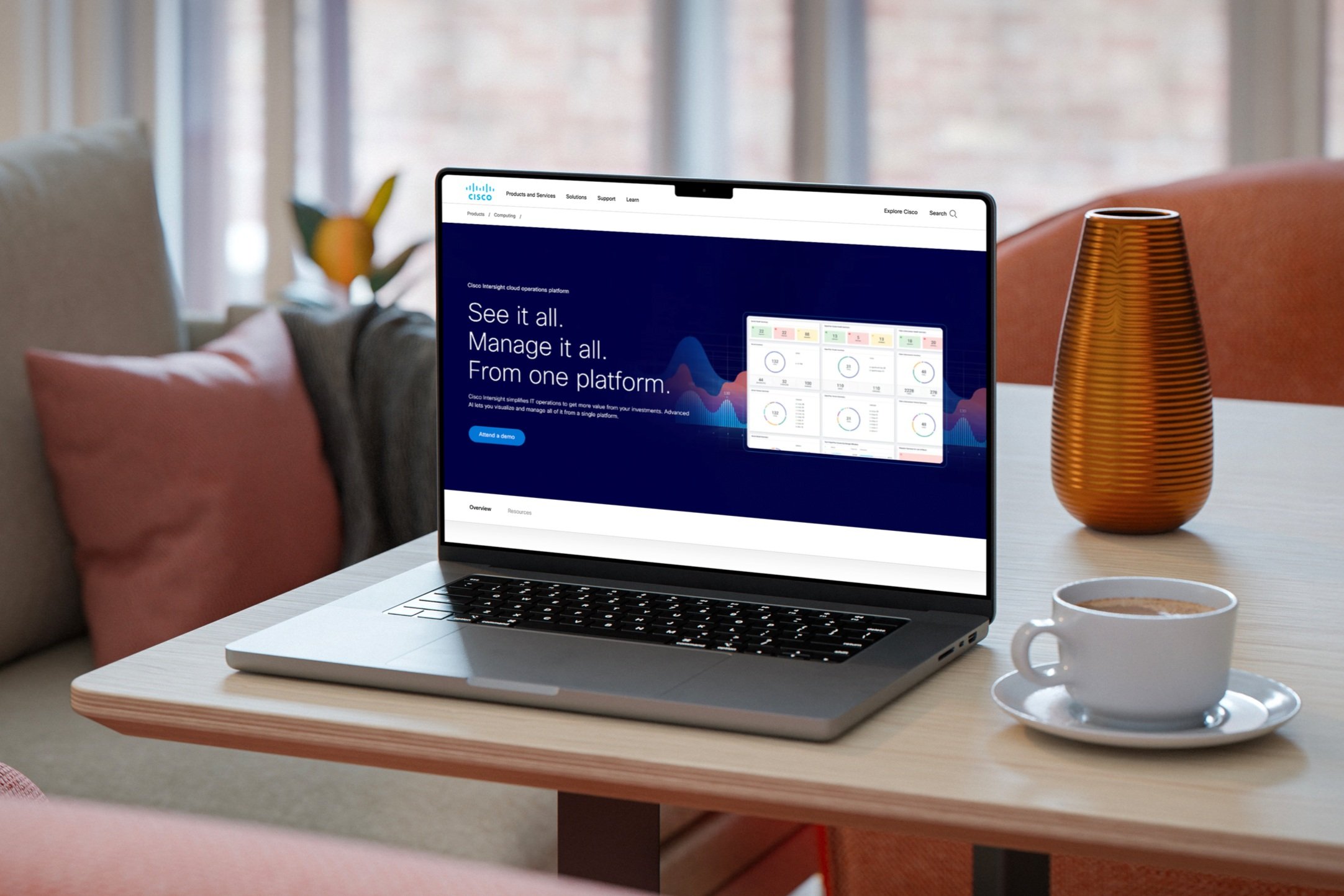
Hero pattern graphics


Search field component UI design
I designed the search field UI component and established key styles for all interaction states.
Pagination component UI design
I led the UX and UI for Cisco.com’s numbered pagination. View pagination project.
Software-inspired graphics
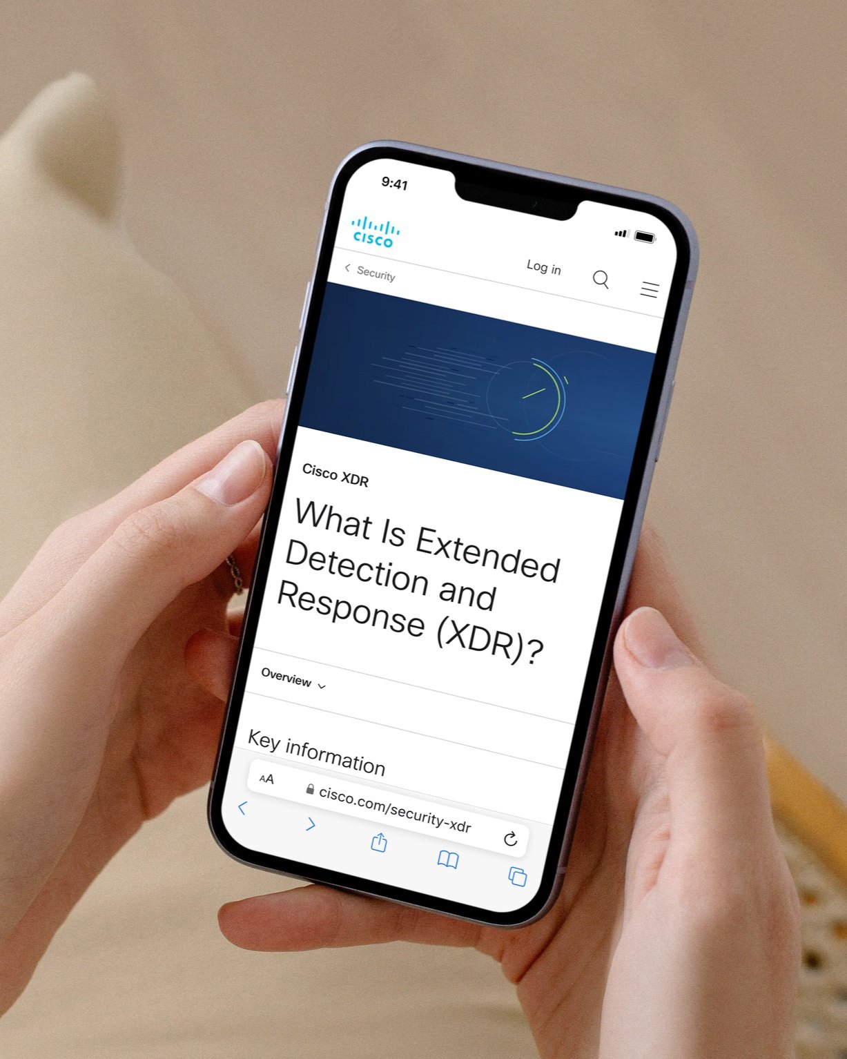
Drawing inspiration from Cisco’s security software, I created vector graphics that are featured across several security-specific webpages on Cisco’s website.
Other significant contributions
-
As part of the Cisco.com redesign, I led a comprehensive audit and overhaul of the color system, focusing on clarity, consistency, accessibility, and visual hierarchy. I reviewed all UI components—including all interactive states—across varying background contexts to identify areas for improvement.
I reinforced color as a key communicator of information, establishing a scalable color framework built on semantic color roles and color tokens that align with specific UI functions.
KEY CONTRIBUTIONS:
Theming:
Laid the foundation for a scalable theming system, starting with the implementation of a Light Theme (currently live on Cisco.com).
Built the system to support additional themes in the future, ensuring long-term flexibility and consistency.
Color Schemes:
Defined five core color schemes to accommodate different content contexts:Default: White background, dark text, blue buttons—used across most of the site.
High-Emphasis: Dark background with white text—used in endcap sections.
Accent: Light gray background with dark text—used in mid-page content areas.
Full-Bleed Light: Light imagery backgrounds with enhanced contrast for UI overlays.
Full-Bleed Dark: Dark imagery backgrounds with white text and optional light-button styles to meet accessibility needs.
System Enhancements:
Rationalized and reduced neutral tones and blues without defined roles.
Established clear naming conventions for primary colors and frequently used tones.
Solidified semantic color roles to align with UI function and improve maintainability.
Refined hover states across all schemes using tonal variations of the primary color.
Ensured all text met WCAG contrast and accessibility standards.
-
As Cisco.com underwent a major redesign, I identified a key opportunity to bring clarity and consistency to our use of foundations (such as space, color, type size, line height, border radius, border width) among similar values. The previous system relied heavily on hardcoded hex values, leading to inconsistent UI execution, time-consuming updates, and misalignment between design and development.
To address this, I collaborated closely with Dan Hannigan, Cisco.com’s lead front-end developer, and together we led the introduction and implementation of a design token system—transforming how foundational values are defined, applied, and maintained across Cisco.com.
Process/Results:
Collaborated cross-functionally with engineering to integrate tokens into both design files and codebases
Created a single source of truth for all design tokens for Cisco.com
Eliminated hardcoded hex values, enabling faster updates and easier maintenance
Improved accessibility, ensuring all text met WCAG contrast and size standards were met
Aligned design and development workflows, increasing team efficiency and reducing friction
Future-proofed the system that can modify the design token values without breaking the current framework
By championing this token-based system, I laid the foundation for a more cohesive, scalable, and maintainable design language at Cisco—elevating the visual integrity of Cisco.com while supporting agile delivery and brand consistency at scale.
-
I conducted a spacing exploration by analyzing our existing web design work—including components, patterns, and page templates—and identified opportunities for improvement. Through this process, I found that adopting a 4pt base grid would better serve our UI by providing greater flexibility for tighter, more consistent design. As a widely recognized industry standard, the 4pt system ensures scalable and efficient layouts. I presented the findings and proposed design system updates to the team, and collaborated with the entire UI team to implement the new spacing system across our interface.
-
Had a key hand. in building and creating appealing compositions for the pages for both the “Muse UI Kit” file and “Muse Design Tokens” file.
Working with a small team of designers, I helped rebuild our component library using the latest industry standards. I also styled the UI Kit pages, ensuring clear organization and precise layer naming.
Additionally, I designed the Muse Design Tokens file in Figma, populating all content while making key style and format decisions. Both files are widely used across Cisco but are not publicly accessible.
We built functional UI kit components in both default (light) and high-emphasis (dark) color schemes.
-
Leveraging my in-depth knowledge of the Cisco.com’s Muse design system UI, I created comprehensive documentation for a dozen design system components and two core foundations: color and iconography.
The documentation detailed key aspects such as usage guidelines, behaviors, states, use cases, technical implementation, styles, and versioning details. While not publicly available, it provides teams across Cisco with the guidance needed to publish consistent webpage experiences that are aligned with best practices.
-
I helped shape and refine the design language of Cisco.com’s design system by conducting a comprehensive audit of its UI elements.
While leading an in-depth evaluation of UI elements, I identified style inconsistencies that raised concerns about quality, scalability, and longevity. In response, I presented my findings to leadership, prompting a team-wide initiative to refine interaction states, standardize color roles, assess border radius usage, and enhance theming continuity. We also eliminated redundant components and patterns, resulting in a more cohesive, scalable, and systematic design framework.
